One of the key factors to marketing success in the Middle East is understanding and relating with an Arab audience. Given that Arabic is the main language of more than 300 million people it is essential that a brand figure out when and how to localize their logo into the Arabic language to be effective in the region. It is important that the Arabization of a brand’s logo and name be done in a way that is both easy to read in Arabic while maintaining the overall theme and colors that the brand has in English. In this post we will give examples of some big brands that have done a great job at localizing their logos in an easy to read format while maintain the branding.
Subway
Subway has gained huge popularity in the Middle East and you can now find the franchise across many of the countries in the GCC, the Levant, and North African. Subway used innovative designers to capture the famous white and yellow logo and flip it around for Arabic. They were even able to incorporate the arrows at the beginning and the end of the logo to give it that truly Subway feel.
GAP
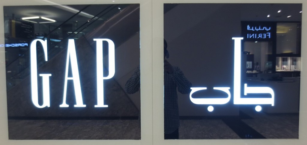
GAP isn’t as popular in the Middle East as some other brands but that didn’t stop them from creating a great Arabic logo. The localized version of the logo maintains the same white lettering and navy blue background. Most noteworthy was GAP’s use of serifs on the 3 Arabic letters. These types of serifs are almost completely foreign to Arabic but GAP was able to use them in a way that was easy to read.
New Look
The UK based clothing retailer is no stranger to localization of their brand with 1,150 stores across 26 countries. Despite this they did a particularly phenomenal job on getting the Arab version of their logo just right. Of particular interest was the way they were able to get the swooping letters in Arabic and English to look so similar.
Burger King
Burger King is another fast food franchise that is starting to pop up all over the Middle East. Not that this one was that complicated, Burger King was able to maintain the bold white lettering on a red background for their localized Arabic logo as well.
Fujiyama
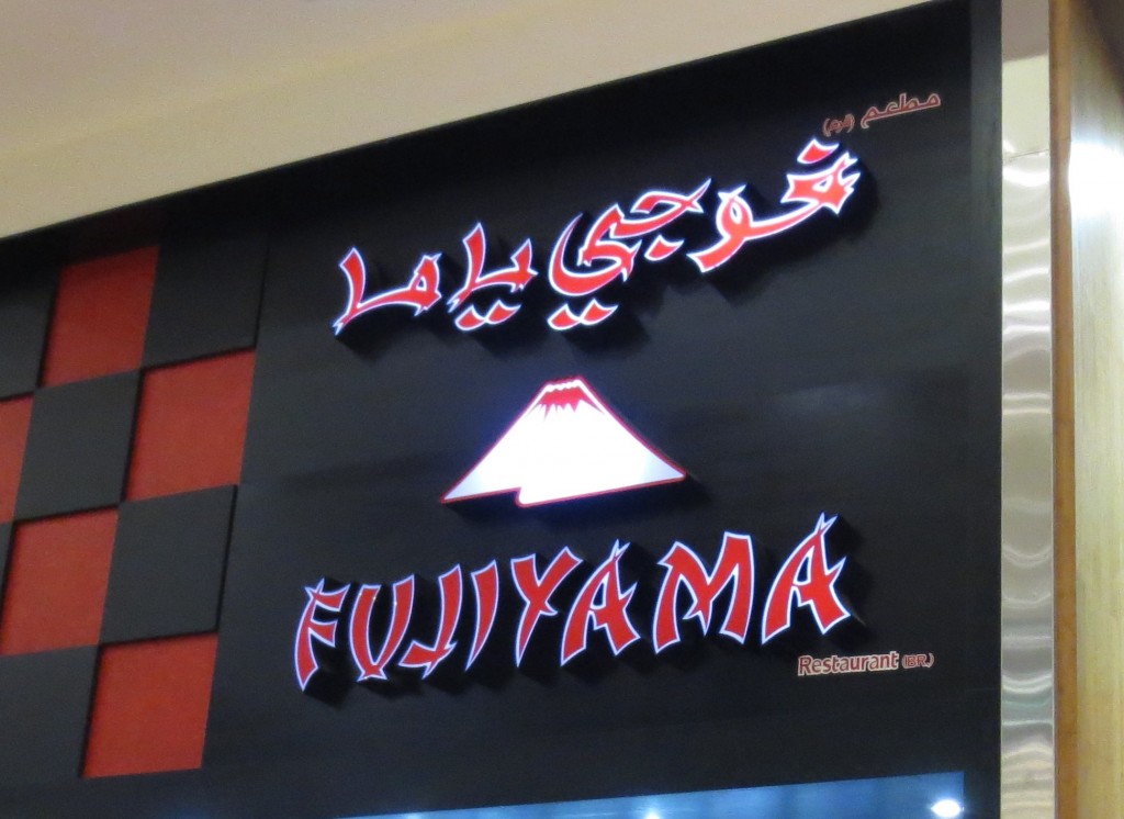
Fujiyama is one of the coolest logos and font renderings we saw in the region. This Japanese restaurant is an awesome example of what happens when 3 different cultures collide. It’s awesome to see that in both Arabic and English you can create a font that mimics the look and feel of Japanese writing.
Starbucks
15-20 years ago if you said that an American Coffee brand would dominate the Arab coffee shop landscape in the Middle East many wouldn’t have believed you. Yet Starbucks has done just that, their coffee shops can be found packed out throughout the Middle East. Part of their success in the region might be due to the fact that they were able to easily create an Arabic logo that closely matches their English one. In addition to their logo, Starbucks often does an amazing job of including Arabesque interior design elements in their coffee shops in the region. See our in depth article on the Starbucks in the Middle East.
Guess
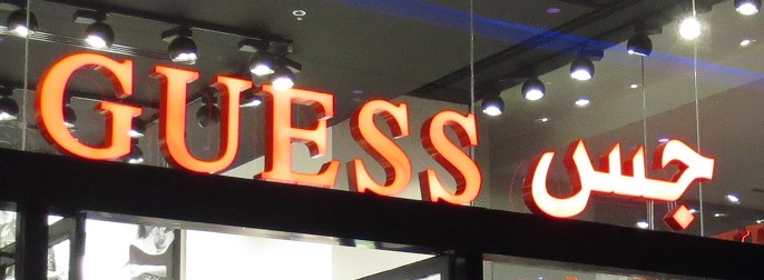
Guess most likely ran into some challenges with the Arabic version of their logo. Even though they were able to keep the Arabic font the same color as the English one there are several issues we see with this one. First, for most Arabic speakers the above rendering of Guess in Arabic is going to be pronounced “Jess”, only the Cairene dialect would pronounce it Guess. Second, and this is probably unavoidable, but since in Arabic the it only takes 2 letters to spell Guess it makes the Arabic version considerably shorter than the 5 letter English version. Finally though the English logo uses a font with serifs, the Arabic version doesn’t.
Pizza Hut
Everybody loves pizza and Arabs are no exception. In light of this, Pizza Hut has been vastly popular throughout the MENA region. Though the Arabic font they use in their Arabic logo isn’t the most easy to read it almost exactly mimics the English font. With the addition of the hut shape it’s easy to notice this is Pizza Hut even if you don’t read Arabic.
KFC
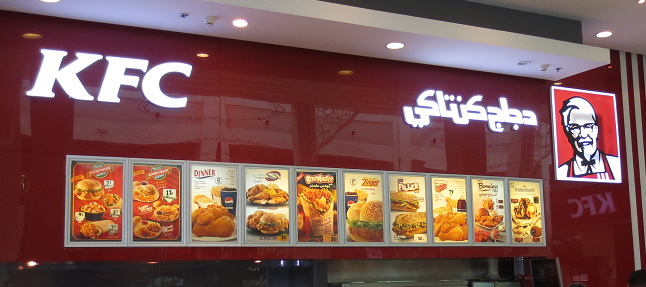
Kentucky Fried Chicken or in Arabic “Kentucky Chicken” is another restaurant that has been tremendously popular in the region. Given that Kentucky Fried Chicken rebranded as KFC many years ago it created a dilemma for how to brand KFC in Arabic countries where KFC didn’t have a clear meaning and there wasn’t yet the KFC brand recognition. In light of this it appears KFC decided to go with a shortened meaningful version of their name “Kentucky Chicken” instead of the abbreviation. Regardless, the Arabic and English logos both utilize an italicized white font on a red back ground. Since the Arabic logo is composed of two full words it is much longer than the English abbreviation. Though we think this was a wise choice it may have made it more difficult for KFC to have both the Arabic and English spelling on marketing materials while keeping balance between the space taken up by each language.
Though this isn’t a complete list of all big brands’ logos in Arabic, we hope you enjoyed it and got some insight into what makes a localized Arabic version of a logo good.
Jordan Boshers
Jordan Boshers is the Chief Digital Strategist at IstiZada, a digital agency that helps companies market to Arabs. He has 12+ years of experience running successful digital marketing campaigns in the Arab world. His insights into Arabic SEO helped him grow previously unknown websites to dominate Arabic niches on Google including growing one site from 0 to more than 2.5 million users monthly. Jordan has consulted for hundreds of companies including helping corporations like Amazon, Berlitz, and Exxon Mobil with their Arabic digital marketing. Learn more here or on LinkedIn.
View all posts by Jordan Boshers


